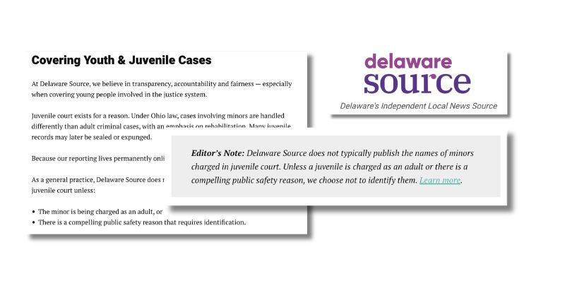
USA TODAY policy graphic border photo
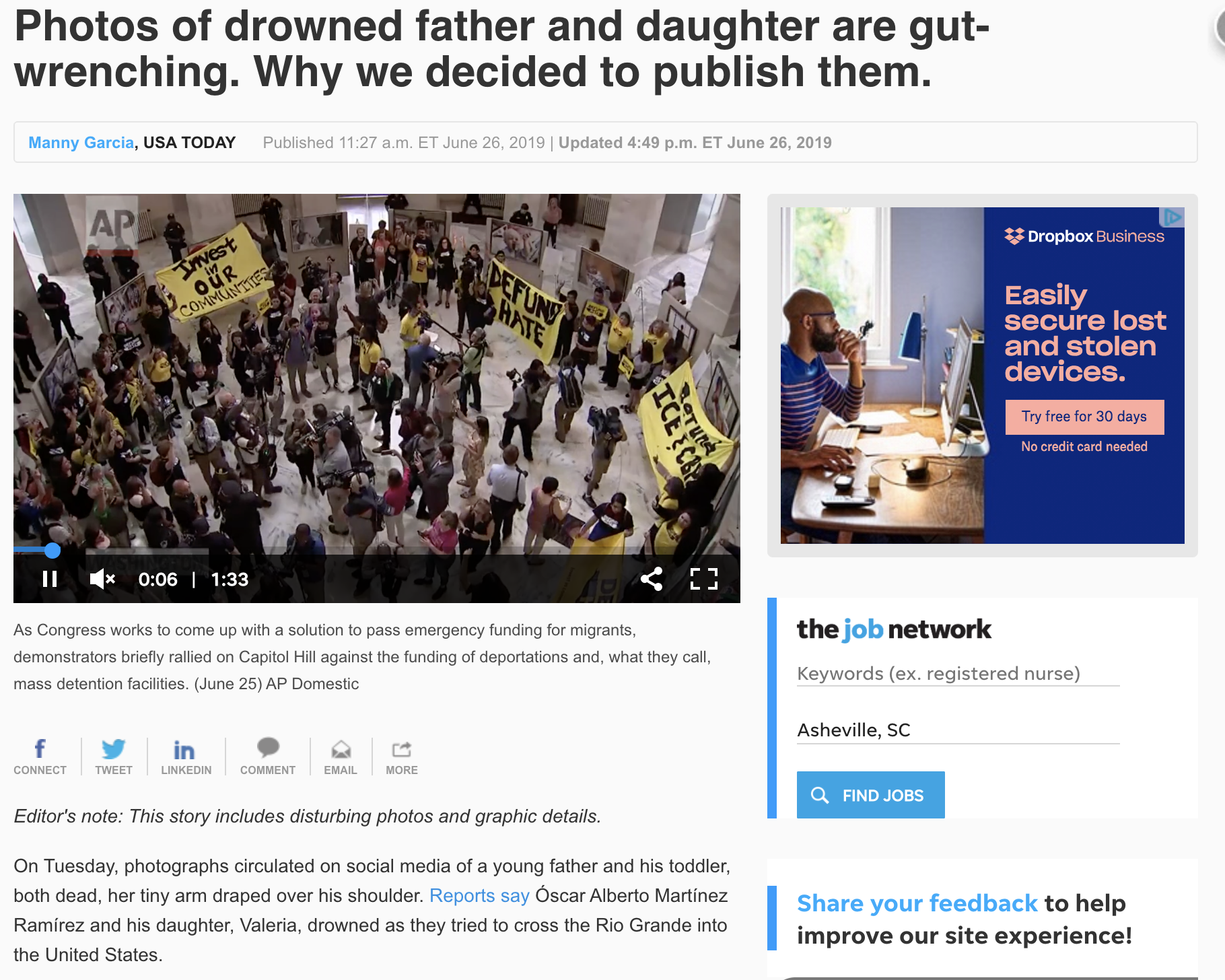
When the heartbreaking photos of a young dad and his toddler who drowned trying to cross the border into the United States emerged, news organizations had to make the difficult decision of whether they would show the graphic photo alongside their reporting. When USA TODAY made the call that they would run the photo, standards editor Manny Garcia wrote a column explaining the reasoning behind the decision. “This is a story that must be told — fully and truthfully, with context and perspectives from all sides … Death is a constant along the border, but rarely is it captured in such a direct way,” Garcia wrote. It’s likely the column got much less traffic than the actual news story itself, leading to the assumption that a lot of readers didn’t see or know the level of thought the paper put behind this decision to run the graphic photo. To level up, we recommend including a sentence about their decision and linking to the column in the caption of the photo itself. That way the explanation would appear alongside the photo in every story it was attached to.
mollie@trustingnews.org | + posts

Project manager Mollie Muchna (she/her) has spent the last 10 years working in audience and engagement journalism in local newsrooms across the Southwest. She lives in Tucson, Arizona, where she is also an adjunct professor at the University of Arizona’s School of Journalism. She can be reached at mollie@trustingnews.org and on Twitter @molliemuchna.

Leave a Reply

Your email address will not be published. Required fields are marked *

This site uses Akismet to reduce spam. Learn how your comment data is processed.